
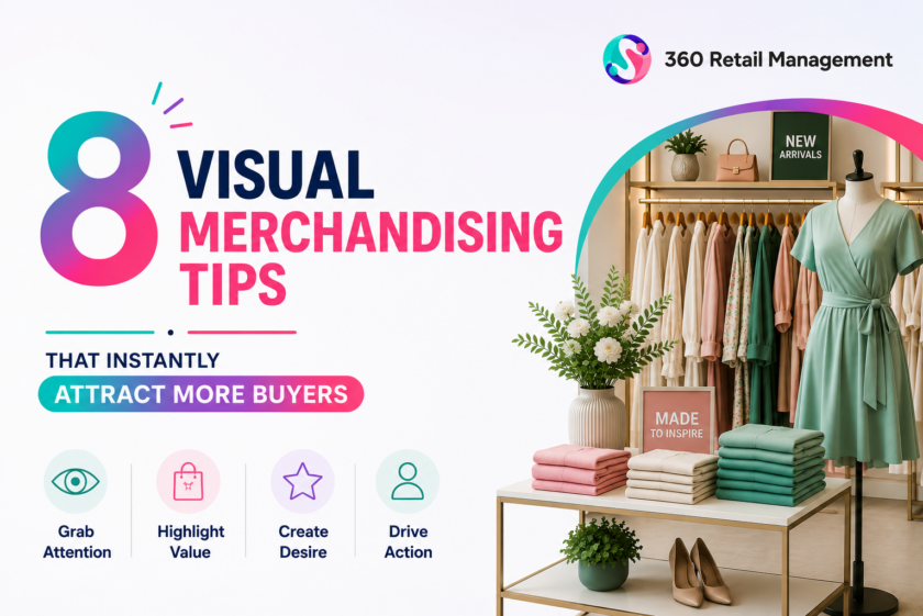
8 Visual Merchandising Tips That Instantly Attract More Buyers
Walk into any Apple Store and notice something unusual: there are no price tags screaming at you. No cluttered signage. No stacked boxes. Just clean white tables, perfectly spaced products, and curious hands reaching out to touch them. That’s not accidental — it’s visual merchandising working exactly as intended.
Visual merchandising is the art of arranging your store so shoppers feel something before they think something. Done right, it shortens the path from “just looking” to “I’ll take it.” These eight tips are drawn straight from the retail floor — real stores, real results.
Tip 1: Make Your Entrance Do the Selling Before a Single Word Is Spoken
Retailer example: Nike Flagship, New York City
When Nike opened its six-floor flagship on Fifth Avenue, they didn’t put a sale rack near the door. They put a basketball court. Visitors stepped in and were immediately transported — not into a shop, but into a sport.
Your entrance is your handshake. Shoppers decide whether to slow down or walk past within the first three seconds. Use your front window and entry zone to display one dominant visual story — a seasonal colour palette, a lifestyle scene, or a single hero product. Avoid cluttering it with price tags and promotional banners; that kills curiosity before it starts.
“The window is the first sentence of your story. Make it impossible to put down.”
Tip 2: Use the Rule of Three to Make Any Display Look Curated
Retailer example: Anthropologie, Global
If there’s one trick visual merchandisers swear by, it’s grouping items in odd numbers — especially threes. Anthropologie has built an entire brand identity around this. Walk into any of their stores, and you’ll see trinkets, fabrics, and décor arranged in triangular compositions: one tall item, one medium, one low. It creates visual rhythm without looking rigid.
The brain reads even numbers as symmetrical and finished. Odd numbers read as dynamic and ongoing — they invite the eye to keep moving, which keeps the shopper browsing. Try it with tabletop arrangements, shelf groupings, or window displays.
Tip 3: Light Your Hero Products Like They Deserve to Be Lit
Retailer example: Lush Cosmetics & Tiffany & Co.
Tiffany & Co. uses carefully angled spotlights to make every piece of jewellery appear to glow from within. Meanwhile, Lush bathes their fizzing bath bombs in warm amber lighting that makes the colours pop like candy. Two very different stores — same principle at work.
Lighting is the most underused tool in retail. A product under flat fluorescent light looks ordinary. The same product under a focused warm spot looks special. Identify your three to five highest-margin products each season and give them dedicated, directional lighting. The ROI is measurable — studies consistently show accent-lit products sell 30–50% faster than shelf neighbours.
Tip 4: Tell a Lifestyle Story, Not a Product Inventory
Retailer example: IKEA, Worldwide
IKEA doesn’t sell a sofa. They sell a Sunday morning — the lived-in blanket, the coffee mug on the side table, the book left open. Every room display is a complete lifestyle scene designed to trigger a specific feeling: cosy, organised, modern, playful.
When shoppers see a product in context, they stop evaluating its price and start imagining their life with it. That emotional shift is the whole game. Whether you run a fashion boutique, a homeware shop, or a sports equipment store, build at least one styled scene in your space. Show the product being lived — not just stocked.
“People don’t buy products. They buy better versions of themselves.”
Tip 5: Use Colour Blocking to Guide Eyes — and Feet
Retailer example: Zara & H&M
Stand at the entrance of any Zara store, and you’ll notice their merchandise is arranged in clean colour blocks — all whites together, all blacks, all neutrals. It looks effortlessly elegant, but it’s deeply strategic. Colour draws the eye across the floor and subconsciously guides customers through the store’s flow.
H&M takes it further by using bold colour contrast at aisle ends to pull shoppers toward the back of the store — a technique borrowed directly from supermarket merchandising. Identify your natural traffic path and deploy colour as a silent director. A bright accent colour at your store’s rear will pull footfall further in, boosting exposure to more products.
Tip 6: Create Breathing Room — and Watch Dwell Time Climb
Retailer example: Muji & Apple
In the 1990s, Paco Underhill’s retail research found that when shoppers felt they might bump into other people or fixtures — what he called the “butt-brush effect” — they immediately moved away and often left without buying. Crowded, cramped displays don’t read as abundance. They read as chaos.
Muji and Apple are masters of strategic emptiness. Wide aisles, generous negative space between products, and uncluttered shelves signal quality and respect for the customer. If your store feels packed, remove 20% of your floor stock. Counter-intuitively, sales almost always go up. Space gives shoppers permission to slow down — and slow shoppers buy more.
Tip 7: Put Your Best Sellers at Eye Level — and Your Margins Above
Retailer example: Whole Foods & Waitrose
Supermarkets have known for decades that eye level is buy level. Premium grocers like Whole Foods and Waitrose use shelf position as a revenue lever — their highest-margin private-label products sit squarely at 120–150cm, while national brands anchor the shelves above and below.
The same rule applies to any retail format. Audit your shelves: what’s at eye level right now? If it’s a slow-moving line or a low-margin product, you’re leaving money on the table. Your most profitable items belong in the prime zone. Your best sellers can carry lower positions — they sell themselves. Reserve the goldmine shelf for the products that need the nudge.
Tip 8: Refresh Your Displays on a Schedule — Before Boredom Sets In
Retailer example: Uniqlo & Primark
Uniqlo rotates its window displays every two weeks. Not because they run out of ideas — but because regulars need a reason to re-enter. A customer who visited three weeks ago and sees the same window has been silently told: nothing’s changed. Primark achieves this at massive scale by rotating front-of-store feature zones every ten days, creating a treasure-hunt culture where shoppers come back specifically to see what’s new.
Set a visual merchandising calendar. Plan seasonal refreshes, mid-season rotations, and weekly small-scale tweaks to your feature tables. Even rearranging an existing display can make familiar products feel new again. Novelty creates footfall — and footfall creates revenue.
“Give your regulars a reason to look twice. Then again. Then buy.”
Put These Tips to Work in Your Store
At 360 Retail Management, we help independent and chain retailers audit their visual merchandising, build seasonal display calendars, and train in-store teams to implement these principles consistently. The gap between a good-looking store and a high-converting one is often just a few strategic adjustments.
Get in touch with our team today.


